The pic clearly shows dots that are no where near a straight line
I am certain what you are seeing in your first example is because of the map scale, and of the difference in data density between a KML/KMZ file and actual position reports. Also, your expectations may need recalibration.
Go back and look at your first example of someone else's trip map closely enough (zoom in) so that you see only a few position report dots. I'll bet you a nickel that the lines between the dots don't follow the roads very closely, although the dots themselves are always right on the road. But since you are looking at an area of several hundred miles on a side, the map loses resolution needed to display every twist and turn in detail. Also, the markers partially obscure the roads, and only the major roads are shown.
Your track sample from yesterday covered only a small amount of ground-- the image looks like only a couple miles on a side?-- nowhere near the amount of real estate shown in the sample you selected as the objective. I count a total of 8 points to define the track. That's all the data SpotWalla has to work with when plotting the track of your ride.
Using the link you provided I zoomed in a bit and guess what? When I look at an area smaller than the entire CONUS the connecting lines don't follow the roads there either. BUT-- they do more-or-less coincide with the planned route and, more importantly, they show that the rider was making progress at more-or-less the expected rate and sticking to his plan.

Looking at the link you gave from the IBA rider's SpotWalla page, I believe the blue line is the "expected" GPX data that the rider created from his trip planning software ahead of time and then uploaded, and that the dots and the thin red line are SpotWalla tracking data collected during the ride. The planning line is much more detailed because the GPX IS built to follow the roads so it inserts points as needed to do that.
The brown positions are roughly 1:40 (100 minutes) apart; some are a bit more perhaps due to delays in when they got sent to SpotWalla but of the first dozen none were less than 100 minutes apart. So, I bet they are automatic positions where the green ones and the yellow flags were the rider manually sending in an update at particular locations (gas stops or rally bonus sites).


Try this experiment:
1: Use your planning software to lay out a route that follows the Dragon, then export it as a KML/KMZ file and upload it to SpotWalla as a track.
2: Look at the overall route on SpotWalla's map. Looks pretty good, doesn't it?

3: Now zoom in very close on one of the tight curves. See the straight line segments? The start and end points of any given segment are only a few feet apart.

IF you traveled that route with your tracking software activated, AND at a speed where your every-few-minutes position reports approximated the spacing of the data in the KML file, your track would follow the road very closely. If you had the option to travel at normal speeds and to update position every few seconds, your track data would also follow the road very closely. But, there would be a LOT of it.
Since your positions are only reported every few minutes at most, there is WAY less detail in the data than what is in the plan. If you travel the route at a higher speed than a snail, your known position reports will be much farther apart than the KML data points.
And since trips are created from only known/reported positions, Spotwalla makes no attempt to infer how you got from one to the next. Quite often there may be several ways to do it, especially at reporting intervals that are many minutes apart. Did you take the main road and travel slowly, or take a back road at high speed? Were you stuck in traffic? Did you stop somewhere? Spotwalla doesn't know, and won't guess.
[HOMEWORK: try it in the field! Lay out a route of a couple hundred miles, upload it as a KML/KMZ Spotwalla track. Next, create a SpotWalla trip, then go ride it and overlay the actual (trip) with the planned (track). Make the ride long enough that you generate a couple dozen locations at a minimum, and to help with that set your device to report position as often as it supports. What is the result?]
So why does the IBA recommend SpotWalla? I suppose it is because you can show them your plan in great detail, and then you can overlay the position reports (clearly this is possible but I've never tried it) to show that you did follow that plan, more-or-less. Given the amount of territory you cover in an IBA event, and if you update your position every five or ten minutes, it's pretty safe bet that any "significant" deviation from the plan will become apparent pretty quickly.
Finally, the appearance: You can change the appearance of the markers shown for a *trip* but can only change the line color/weight for tracks. And I have just learned from the SpotWalla site that you overlay a *trip* on a *track* by editing the *trip* to include the *track*. Tracks can be created ahead of time or from on-the-fly real time position data. Trips are date-bounded actual position data only, if I am understanding them correctly. Trips get the vehicle icons but tracks don't.
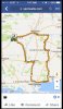
Here's my final example. In 2016 I went to the GA Spring Rally (we met there). I *planned* to ride the Blue Ridge Parkway, and got as far as Roanoke before changing my mind. The purple line (and yellow pushpin icons) show my plan for the trip south. The brown dots are the actual trip data (going in both directions; sorry about that. The lower-numbered items are the outbound leg that goes with the purple track.)
You can see that north of Roanoke I was following my plan, but after that I bailed out and jumped on I-81. Here's the link to my
SpotWalla trip data for that weekend, if you want to look at it in more detail.

That's all I've got-- hope it helps.