Andrew Shadow
Site Supporter
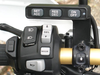
You should send that picture to McCruise and suggest that they make their switches that way- with both text and pictograms. I think that it is an improvement over their version.I even made some P-Touch labels for the supplied switchpod
I VERY much despise pictograms that have no text included! Cryptic symbols is a much better description of them.dropped the text for cryptic symbols
The McCruise only has three buttons, so not a problem. Most electronics have so many pictograms that no one knows what most of them are indicating. The pictogram works well for quick identification of buttons that are both common and commonly used, but not so well beyond that.
Previously most things were either labeled in English, or had a pictogram with an English descriptor as well. Regardless of what a person's Mother tongue is, at a minimum everyone who has rudimentary English reading skills can figure them out. Now, with pictograms only, nobody can figure them out including those people who read English. Everything now comes with a multi-lingual legend deciphering what the pictograms mean. If a legend is needed in multiple languages, this indicates that no matter what language people speak they are unintelligible, but also proves that the pictogram paradigm doesn't work once more than a few are being employed.